The "80/20" Rule, Revisited
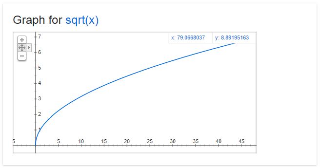
I've always loved graphs, as they are so effective at taking complex ideas and conveying them simply. As I was thinking recently about the relationship between the effort I put into something and the output I get as a result, a few different graphs came to mind. the "80/20" rule has been talked about a lot--the idea that there are diminishing returns to your extra efforts. This assumes that if you were to graph output against input, it would look like this:
In this case even though every extra bit of effort does yield more output, the returns are diminishing and eventually the effort may no longer be worth it. For me, choosing a font falls into this category; Spending a little time is good, spending a lot of time is definitely not good. But are all activities like this? I don't think so.
Some activities have a more linear curve. When I paint my house, every extra hour of work is more or less equally productive (until I get reaaaaaally tired.) in this case there's no reason to stop at 80%.

And then there are the times where each extra bit of effort actually returns you MORE than the bit before. Think about doing push-ups, or any other exercise. Those last reps, when you're so tired you can barely hold yourself up, are the ones that give you the most benefit. In this case the 80/20 rule goes out the window again, and it actually makes sense to give it everything you've got.

Here's what I started to wonder: what if a lot of activities are actually in this third category? Perhaps it's worth it to give it everything we've got way more often than we think. Sometimes you build up momentum, and sometimes perfection really does matter. At the very least it's good to know what kind of function you're dealing with so you can make an educated choice of how much energy to put in.
Thanks to Google for the graphs. Search results these days are amazing!